EXPRESSIVE TYPOGRAPHY
Expressive typography is an art where you turn letters into images that express something, usually something to do with the words definition. For this project, I will take five words and convert them into expressive typography. They five words that I ended up with were explosion, tree, cut, family and top.
INITIAL DESIGNS
After I received the words that I would have to change, I began my work by coming up with five initial designs for each word that I will later use for inspiration when making my final pieces of work.
I began with the word explosion. Most of the design ideas that I came up with were based on the idea that the letters were exploding out in random directions. But my favorite was the second, where I made the word in the shape of a mushroom cloud.
Next I came up with my ideas for the word family. This one was probably the hardest to make expressive. Most of my ideas were based on making two of the letters big to represent parents.
After family, I came up with my ideas for Tree. I mostly focused on the idea of the letters forming roots and branches to make the word look like a tree.
Then I came up with my design ideas for the word top. Most of the ideas were based around height, I even had one idea where the word was a tower and the P was shaped like a flag. but I think I will chose to go with my idea of having the T as a table with the other letters on top.
Finally I came up with my ideas for the word cut. Most of the ideas I came up with had the letters missing parts as if they had been cut, but I think that I will go with my first design to draw lines on the letters to make them look cut.
EXPRESSIVE TYPOGRAPHY RESEARCH
After I finished my initial designs for my five words, I did some research on existing expressive typography by searching google images to give me some inspiration for my own work. I actually managed to find two explosion examples when searching which is useful as it is one of the words that I have to do. I like the first one where the word is exploding around the letter O. Its actually a lot like one of my designs but I think it is more effective as it is easier to read.
DEVELOPED DESIGNS
After I finished my research I started to develop my designs in illustrator. I created my designs by taking my favourite initial designs and developing them using the inspiration that I got from my research.
 The first word that I did was Tree. I had originally planed to have the E's facing down with roots growing out of them, but I thought it would be too hard to understand. So I chose another of my original ideas and made the letters look like they were cut down. I then decided that I would add lots of other T's to make the design look like its in the middle of a forest.

The next design that I did was of the word top. I decided to go with one of my initial designs which was to make the T look like a table. After I finished the table bit, I realised that if I flipped the P around, it would look a bit like a chair. So I made two copies of the P using the alt key, and positioned them under the table.

After I finished my top design I moved onto family. I actually wasn't happy with any of the initial designs that I came up with for this one, so I wasn't sure what I was going to do. But after I typed family out in the helvetica font, I realised instead of altering the shape of the letters, I could make copies of them and shape them in to a house. I began by making two copies of the I and turning them into walls. The roof is a copy of the letter A, and the windows are L's.
 Next I developed the design for the word cut. This design is a developed version of one of my initial designs, its pretty much the same but i changed the colours. To create it I made the word white and made the background black. I then streaked black lines over the letters to make them look like they had been cut into small pieces.

The last design to develop was the word explosion. Its is based one of my initial designs. It is meant to look like a mushroom cloud, the EX is the bottom of the cloud, and the PLOSION is the top of the cloud. I didn't really change the design of this much from the initial because I was already happy with how it looked.
EXPRESSIVE QUOTES DESIGNS
After I finished with the five words, I began making five quotes expressive. The quotes that I got were, "an eye for an eye makes the whole world blind", "with great power comes great responsibility", kill the body and the head will die", "practice makes perfect" and "yesterday is history, tomorrow is a mystery, today is a gift, thats why its called the present". The first thing I did was make five initial designs for each quote on paper.
These are my initial designs for my 'great power, great responsibility' expressive quote. For most of them I just played around with the orientation of the words and font size. A good example of this is the 3rd design that I did where I made the words GREAT in bold to emphasise them. My 1st design is one that I rotated the words a lot, but it looks more confusing than good.
Next I made my initial designs for my 'eye for an eye' expressive quote. I played around with changing the positioning and font size, but my favourite designs are the ones where I incorporated an eye into the design like the 1st and 5th designs. My favourite is the 5th design where I arranged the words to look like an eye.
These are my 'yesterday is history' expressive quote designs. I decided that I would emphasise the words yesterday, tomorrow and today. I did this mainly by changing the size of the font so that those words were larger than the rest. My favourite design was the top middle because I like the composition and size of the words.
After I made my initial 'practice makes perfect' expressive quote designs. As this quote only has three words, I knew that I would have a lot of space to play with the composition of the letters. I also played around with the Idea of making the word makes like an = in my 3rd and 4th designs.

This is the sheet of my initial expressive quote designs for 'kill the body and the head will die' which is a Hunter S. Thomson quote. Since its a bit of a disturbing quote, I made the composition of the designs quite chaotic. I did things like mixing fonts, text size and orientation.
FINAL DESIGNS
When I finished my initial designs on paper, I started my final expressive quotes on Illustrator. I picked my two favourites of each quote to finalise on the computer.
 These are my two finals for the quote 'eye for an eye makes the whole world blind'. The first one is based of my initial design where I positioned the words to look like an eye. This is one of the few designs where I decided not to add a texture effect, I thought that a plain black background would emphasise the theme of blindness. I originally planned to make the pupil plain white, but after playing around with the gradient tool a bit, I found that I could give the circle a cloudy look like a blind persons pupil. I am also really happy with the fonts that I downloaded of fontsquirrel.com because they go together well on this design.

For my second 'eye for an eye' final, I decided to base it on my one of my initial designs where I made the word 'eye' shaped like an eye. I did this by warping the words. I then positioned the eyes and added the rest of the text. All the fonts I used were ones that I had previously downloaded from fontsquirrel.com. After I had finished positioning the text, I added a background texture of desert sand. I don't know why I chose to have sand as the background texture, but for some reason whenever I think of this quote I think of a desert.

These are my final two designs for the quote 'with great power comes great responsibility'. I had originally planned to make this poster with a spider web background texture, but I couldn't find a good one so I decided that I would just draw the the spider web using the line tool. After I finished drawing the web I realised that it would look pretty good if I put the text between the strands of web. So I typed out each word and then used the create outlines command so I could change the shape and size of each letter individually.
 This is my second final design for the 'great power' quote. I decided to base it on my initial design where I emphasised the word 'great'. I did this by making 'great' red when the rest of the text was a blue. after I finished exiting the size and position of the text, I added a pop art texture. I did this because pop art is often used in comic book illustrations, and the quote is heavily linked with Marvels Spiderman.
REDESIGNING A RECIPE
For this part of the unit, I will be taking a common cooking recipe and make it more visual. The recipe I have chosen is flapjacks as it is a pretty simple recipe and it doesn't use many ingredients.
HISTORY OF THE RECIPE
There are many variations of the flapjack that usually differ depending on the location. In the UK a flapjack is a tray bake made of oats, butter, sugar and golden syrup. Other ingredients such as fruit, chocolate and nuts can be added to the flapjack. North America and South Africa also have flapjacks. However, their flapjacks are thin pancakes that are crispy, chewy and usually about 30cm in diameter.
 |
| Things relating to golden syrup pancakes. |
the Oxford English dictionary first recorded the word flap jack in the early 17th century, but at the time it was used to describe a flat tart or pancake. Shakespeare makes reference to flapjacks in his play Pericles, Prince of Tyre, but it does not suggest that flapjack is a middle eastern dish. Later, the word would be used to describe something similar to an apple flan, but it is not till 1935 that the word flapjack was described as a food made of oats.
 |
| The BBC Good Food recipe for golden syrup flapjacks. |
RECIPE INGREDIENTS
The recipe has four simple ingredients, oats, butter, brown sugar and golden syrup. You can also add other ingredients such as chocolate or nuts. I created a mood board of the ingredients. I got two pictures for each ingredient, one normal and one illustrated.

ART STYLES
After I finished my research, I starred to look into different art styles. This is important because I need to know how I am going to design my poster before I make it. I started by downloading ten fonts from font squirrel that I could use In my final design.

Most of the fonts that I downloaded were sans serif, with spaces between the letters. I downloaded these fonts because recipe titles are generally in fonts that are easy to read. Some of the other fonts that I downloaded like Blackjack and Architects Daughter look hand written. I downloaded these fonts because flapjacks are an old recipe, and a hand drawn title looks old fashioned.
FESTIVAL POSTERS
RESEARCH
for this part of the unit, I will be designing a poster for a festival. Before I can start on my design, I need to do some research. I did this by analysing festival posters. I analysed four different types of festival posters.
IMAGERY BASED POSTERS
 This is a poster of the Woodstock film festival. The poster is largely taken up by the image of the eye and the landscape with very little text. The small amount of text emphasises the image, making you focus on it more. I really like the image on this poster because it was painted and made out of many different materials rather than just being digitally produced. This makes the poster more unique and interesting than a standard digitally produced poster, which will gain the attention of people more effectively. However I think that the poster should have more information on it as it doesn't really inform the viewer of much apart from the date of the festival.

This poster is advertising a film festival held in Seattle. It is similar to the Woodstock film poster because it is mostly taken up with an image with a little text. However, unlike the Woodstock poster, this poster looks like it was all made on a computer. I do like the simple colours of the poster and how imaginative the image looks, but I think that this poster needs more information of the event.
This poster is very visually impressive, but it seriously lacks content. I actually later found out that this is a band and not a festival, which would explain the lack of information. I think that the poster should link to the band because while this poster looks good, its not really clear what it is or what it is associated with.
This is a poster advertising another film festival called Northern Lights. You can tell that this festival is horror based even with out reading the text due to the image. I like the fact that the creator of this poster used the typography to add to the image, but it is quite hard to read the text.
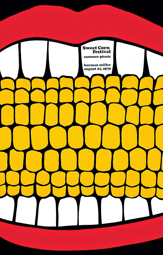
This is a poster for the Herman Miller sweetcorn festival. I like it because it is Saul Bass style, which you don't often see in festival posters. I also like the simple colours and the unusual image draws your attention poster. Unfortunately, the text on this poster is quite small and hard to read. It could also have more information

This is a poster of a customised Russian doll show in Bristol. I like the way that they combined the names of the artists with the silhouette of the doll, its good to see a poster that tells whats going to happen at the event, not just the date and location. I also like the colours and the fact that the date and location is easy to read.
TYPOGRAPHY BASED POSTERS
This is a poster for the voice of the voiceless festival. Although this poster does have the image of the face, I think that the poster focuses much more on the text. I like the Saul Bass style typography and I think that it goes really well with the colours of the poster. However, while the typography looks good, I think that it is a bit too hectic. The wonky lines of text and random boxes makes it hard to read.
 This is a poster for the Esalam hot springs festival. Although the poster is mostly made up of an image, the image is completely made up of text which makes it more typography based. I like this poster because it uses the text in a really interesting way, and it has a good amount of information on it. I also like the simple colours. However some of the letters are so distorted that it is hard to read them.
This is the poster for the firefly music festival. I picked it as one of my typography posters because of the amount of text it has on it. While I have often talked about how important it is for the poster to have enough information, I think that this poster has too much which makes it a bit over whelming. If a poster has this much writing on it, most people wont bother to stop and read it. Although there is too much text, I do like the font and the colours of the poster. I also think that the backgroung graphics look really good.

This is a poster for the hang out music festival. It is a nice mix of text and image, the font goes well with the image style. I also like the simple colour scheme of this poster, a mix of different blues and yellows. The only problem that I have with this poster is that I think it has a bit too much text.
This is a poster for the treasure island music festival. I like the way that the title uses the space on this poster. The mix of colours are also nice, it seems to have some rasta influence due to the red, green and gold. However, due to the positioning of the words, it is hard to know what order you have to read the words. Another problem is the fact that the title takes up so much space that there isnt much room for other information.

This is a poster of the stereo sounds festival. I like this poster because of it variation of font styles and colour. Another good thing about this poster is the fact that despite there being a lot of different fonts, they are all easy to read. The contrast in the colours also makes it easy to read the text. However, the fact that there are so many different styles on this poster could be a bit too much for some people.
LOCAL POSTERS
 This is a poster for the Bristol balloon festival. I like this poster because of its simplicity. The colours, font and imagery are all very simple, there is also a good amount of information. All of these things together make this poster very effective.
This the poster for Brisfest. It is very text based. I think that the poster has too much information and is a bit overwhelming to look at. I like the graphics on the poster, but they are very small and theres not that many of them. I think that more space should have been used for images on this poster and that is should have less text.
 This is a poster advertising the rhythm and roots festival. I really like the rustic art style, and the main image of a guitar growing into a tree, it has a very folksy look to it. The image also looks like it was painted instead of digitally produced. However, while this poster is very visually impressive, it lacks information. The poster doesn't say much about the festival, I think to make it better, it could have focused more on typography.
This is a poster for the Grillstock music festival.
RELATED POSTERS