PERSPECTIVE DRAWING
ONE POINT PERSPECTIVE
When drawing in one point perspective, everything you sketch on the page will link back to a single point, known as the vanishing point. |
| My first one point perspective drawing. It went alright but I found it really hard to get the sofa right. |
 |
| My second one point perspective drawing. This one went much better because the hallway was simpler to draw. |
 |
| My third one point perspective drawing of a kitchen. It mostly went well but certain parts of it look wrong like the window. |
TWO POINT PERSPECTIVE
Two point perspective drawing is similar to one point except that there are two vanishing points instead of one.
 |
| My two point perspective drawing of a building. The vanishing points are on either side of the building. I used the vanishing points to draw the shape of the building, and to get the position and size of the windows right. |
PERSPECTIVE DRAWINGS OF OBJECTS
Drawing in perspective is very important in games design, as you could come up with a great character or object design, but if it is to big or small it could ruin the whole image. so I got some practice drawing in perspective by drawing random assortments of objects.
 |
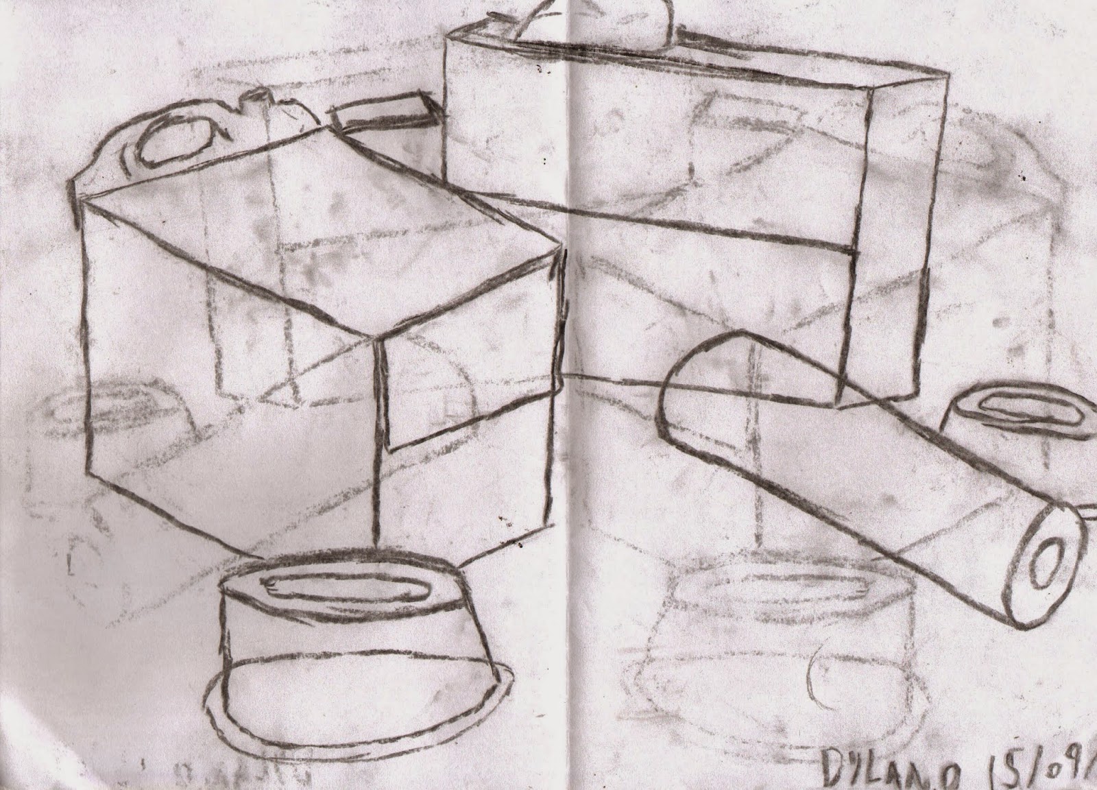
| I sketched a random assortment of boxes and bottles. The hardest part was the bottle handle and lid. To get it in perspective with the rest of the image and look good took a few attempts. |
 |
| This drawing is made up of similar objects from the above drawing, but I did this one with charcoal. Using charcoal can be difficult because you have to be careful with line thickness. I am happy with the end result but it got quite smudged before I could scan it. |
 |
| In this sketch I tried to draw a collection of random objects in front of me. The most important thing was to get the positioning of the objects right because if they weren't, it made it harder to get the perspective right. I think that I mostly dot it right, except I think that I drew the scissors a bit too small. |
 |
| This is the same as the drawing above except that I shaded all of the blank spaces in to make the objects clearer. |
DRAWING CLOTH
Cloth is very hard to draw as it creases a lot. It also settles into unusual shapes. These creases and shapes that cloth form make it very hard to draw, but it is a useful skill to have. So I tried to draw some cloth in the style of Albrect Durer, a German painter from the late 1400s.
 |
| My drawing of some cloth hanging. the hardest part was trying to draw the creases and the parts of the cloth that overlap. |
DRAWING PEOPLE
Probably one of the most important skills to have as a game designer is to be able to accurately draw people. while I have drawn people and characters that I have designed before, I will hopefully be able to learn some new techniques for drawing people.
PORTRAIT AND 3/4 FACES
One of the hardest things about drawing faces is getting the right proportions for all of the features. Its is also very hard to draw faces looking in any direction other than forward. So I got some practice by drawing one of my classmates faces and a character that I made up.
 |
| I am very happy with my portrait drawing as I think that I mostly got the proportions of his facial features right. However my 3/4 view drawing ended up looking a little strange. |
 |
| I really like this drawing. I was just practicing my 3/4 view drawing. When I finished the characters head I noticed that he looked like some sort of snobby nobleman. So I gave him a monocle and named him Lord Argyle. |
 |
| In this drawing, I was going through the process of making a cartoon style 3/4 face. The finished character looked a bit like Beethoven, so I made him look like a composer. |
THUMBNAIL SKETCHES
Next I got some practice drawing posture by drawing my classmates in different poses. I only drew them as frames as I wanted to focus on their stances.
 |
| This is the first sketch. It is alright except for the fact that I drew the hips and waist way too thin. |
 |
| This is another thumbnail drawing. It is of a person in a fighting stance with their back towards me. It didn't work out so well because it is hard to tell which way they are facing. |
 |
| This thumbnail drawing is of a person with their hands on their hips. I am happy with this sketch as I think I got the body proportions and the pose right. |
 |
| A collection of thumbnail drawings. I am mostly happy with the first three. I tried to flesh the fourth one out a bit more. It turned out alright but the arms are too short and the hips are too thin again. |
CONTINUOUS LINE DRAWING
When drawing continuous line drawings, you must try to keep the pencil on the paper for as long as you can. The drawing should only be made up of a few continued lines. My continued line drawings were of the same subject as my thumbnail drawings, classmates making poses.
 |
| I am happy with my continued line drawings. Although the lines are a bit wobbly I think that It makes it look more clothing so its alright. I just wish that I had positioned the first drawing better so it would have fit on the page. |
CONCEPT ART
ARTIST RESEARCH
Chris Foss
Chris Foss began using air brushes In the
1960s and has now become one of the most recognised artists using this tool. He
has created cover art for over 1000 books, most of them sci fi, for
artists such as Isaac Asimov, E. E. Doc Smith and Arthur C. Clarke. He has also
worked in film design on films including Alien, Flash Gordon and recently Guardians
of the Galaxy.


The reason that I decided to research Chris Foss was because I am doing my concept art on a sci fi film about a bounty hunter. I specifically like his art work of spaceships and asteroid cities. I can use these images as inspiration for my own work as I had planned to have a lawless space station and a spaceship in my work.
H. R. Giger
Giger was a painter, sculptor and designer and is most famous for his work on the film Alien which won an academy award for best visual effects.


All of the images above are concepts for the film Alien. Although they are sci fi like Chris Foss' work they are very different from each other. While Foss' work is very colourful and large scale, Gigers work is much darker, and looks claustrophobic. I like the darkness of Gigers work as I plan to make my concepts quite dark and gritty as well. However im not that bothered with the alien architecture as I don't plan to have any Aliens in my work.
INITIAL IDEAS
MINDMAP
CHARACTER DEVELOPMENT
The concept art that I will produce is going to be about a bounty hunter and his robot side-kick. So I have developed different design ideas for both.
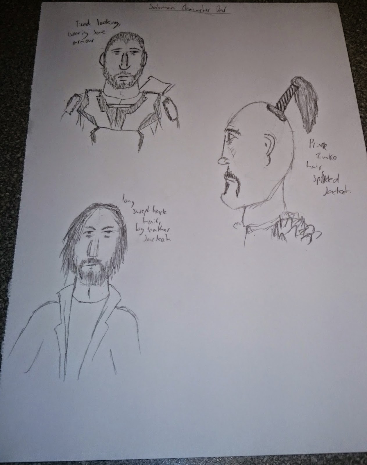 |
| These are some of the design ideas that I came up with for Soloman Gunn. At first I thought that I should give him a shaved head and armor, but I decided against it because it made him look more like a soldier. I then thought about giving him the shaved head ponytail and spiked leather armor, but I didn't really like the way he looks. So I decided to give him long hair and a beard to make him look ragged and a long leather jacket to hide his weapons under. |
 |
| These are some of the designs that I came up with for Soloman Gunns robot companion, K.I.L.S-U. I decided that I wanted to give the robot a sort of skeletal mask. However, I didn't like how buff I made the first design, so I made the next design a bit skinnier. I also gave it a 360 degree cyclops head which was pretty cool, but I wanted to keep the skull mask idea. In my final design Idea I kept the skull mask but removed the jaw. I also gave it a neck. |
OBJECT DEVELOPMENT
The object that I am going to include in my concept art is going to be Solomans spaceship. I I wanted it to look old and rusty, but at the same time pretty cool, like the Millennium Falcon from Star Wars.
 |
| I didn't like the first two designs I did because they were way too boxy. I decided that the ship would look way better if I made it look more streamlined. I also made the ship out of more complicated shapes in my third design so that it would not look so simple. After I finished the basic shape of the ship I began to add some details like pipes on the top of the ship and rusty patches. |
FINAL CONCEPTS
I have two final concepts. One of my characters and a location, and the other is of the object that I designed, Solomans spaceship.
CONCEPT 1
 |
| Soloman and K.I.L.S-U are waiting on a roof top for their target. I changed my character designs a bit for this. I gave Soloman a scar and eye patch on his face to reflect on the dangers of his job. I also gave him armor plates over his clothes for protection. I made K.I.L.S-Us head rounded because It looks better. I also changed his arms to look more skeletal. I had actually intended to make the planet in the sky a moon, but it ended up looking like a planet so I stuck with it. |
CONCEPT 2
 |
| This is my concept of Solomans spaceship. It is flying over a stormy ocean about to pass out of the planets atmosphere. The ship is mostly the same as the design that I came up with in my development. However, I did change the shape of the wings as the rounded ones that I planed to use didn't look that good. I also added a bunch of rockets to the back of the ship for extra speed. Im really happy with how it turned out, Its got a good amount of detail on it and it looks pretty old and rusty but pretty cool at the same time, which is what I was going for. |